Friday, February 7, 2014
Design competition Process
From all the competitions, I decided to draw the millennium handbook cover but it failed many times. The first piece of work I made was with burnt paper and then below the hole I pasted another piece of paper to draw the phoenix. Above I was going to write Millennium High School and below the handbook. To the sides I wrote the years and colored the whole paper. This failed because I made a mistake drawing the phoenix so it messed up the entire piece. The next one I made was very simple but it took a lot of time. I decided to do the same thing but organize it in a different way, and instead of burning the paper, I drew the hole.
I decided to use a font that looked like fire because of the phoenix and also tried to use colors that represented the phoenix. For the second piece of work I did not draw any images and instead made the text stand out more. I also wanted it to look organized, so I tried to align it and made the letters pop out with black so it made a contrast with the piece.
Book Cover


 '
'From these book covers I can see simplicity but at the same time conveying an important message. I think I am mostly drawn to abstract elements and when I saw this, it immediately caught my attention. Another common characteristic they have, are the colors of the last 3 pictures; It has pastel colors, mostly orange and blue. For most of them, there isn't a lot of words because the picture shows everything. Moreover, the first two pictures are very crazy and have a lot going on. The first one has a lot of letters and the second one a lot of patterns and designs. The difference between the first two are the colors, because one is black and the other one very colorful with mostly pinks. I also see alignment in each of the books and I see everything compacted together even if the cover is very hectic.
Wednesday, February 5, 2014
Book cover "The Shack"

I think that the design is successful in capturing the book's main idea because it has a sense of mysteriousness but at the same time of comfort. The book was about a man named Mack who held a really dark memory of the hidden shack in the woods because it held the memory of his daughter who was murdered while the whole family was camping. This cover seems very scary, mysterious, and the same time the snow gives the reader the chills. However, when Mack comes back to the cabin after many years, he meets God in his dreams which transforms the cabin into a beautiful house with a green garden and in the cover you can see that light is shining through in the right side and also a plant growing out. Therefore the book cover shows that there are two sides of the story; the beginning is dark and in the end everything gets better
Wednesday, January 22, 2014
Logo reflection

- How does your Logo design represent the after school club or activity? (Font choice, symbol, colors, layout, etc)
My logo design represents the after school activity of dance club because I wanted to create a symbol to unify all the elements, and at the same time represent the unity of a dance team/club. Moreover, when I saw the font, it immediately gave it a sense of motion which relates to dance. The colors I used were very fun, energetic and wild which made me think in the way that dance is an energizing, fun and sometimes wild activity, especially hip hop. I also used a lot of pink, because while I talked to the head of the team, she told me there were only girls, so I decided to create a design for girls.
- Which process was most helpful in creating your design? (research thumbnail sketches, concept board, 2 rough drafts, digital draft on Gimp, etc.)
The concept board was the most helpful because I got to combine different ideas and understand what I wanted to choose or not. It was also helpful because, it didn't have to look nice, or anything in particular. It was only brainstorming.
- What was the most challenging aspect about the logo project?
The most challenging aspect about the logo project was using gimp, because I wanted to use a lot of images from google but I had to crop them and I couldn't do it with the program. It was also challenging because although we spent the whole unit completing this project, we didn't have a lot of time in each class which took away from completing it faster.
- Are you satisfied with your final design? Why is your logo successful? If you not satisfied with your design, what would you like to change?
Yes, I am satisfied with my final design because I worked hard to finish it and at the end it came to be creative, unified, colorful, and also meaningful
Wednesday, January 15, 2014
Memorable moments of 2013
- Meeting new people that have become my best friends!

- Traveled to many different places which is one of my favorite things in life!
-Had a lot of fun with friends and family!

- Had the greatest rest in a beautifullll hotel that had the greatest view!
-Turned 18!!!!!!

Did some extreme sports!!!!

-Had lots of happiness and lots of lovee

- had visits from far far way! (Colombia)

- Got a serenata (serenade)

- had the greatest time in high school, which was the beginning of an end.

- Traveled to many different places which is one of my favorite things in life!
-Had a lot of fun with friends and family!
- Had the greatest rest in a beautifullll hotel that had the greatest view!
-Turned 18!!!!!!
Did some extreme sports!!!!
-Had lots of happiness and lots of lovee
- had visits from far far way! (Colombia)
- Got a serenata (serenade)
- had the greatest time in high school, which was the beginning of an end.
Wednesday, November 27, 2013
summary of the club (dance)
Summary:
The diverse dance team at MHS, aslo known as (D2T) is focused on hip-hop rhythms as a form of developing confidence and self-expression. This dance team is for girls and for boys so everybody has a chance to enjoy this for of self- expression. The purpose of this team is to have fun, to get to know yourself, to relieve stress, and to learn new moves. The club meets on friday after school at the 12th floor gym
The diverse dance team at MHS, aslo known as (D2T) is focused on hip-hop rhythms as a form of developing confidence and self-expression. This dance team is for girls and for boys so everybody has a chance to enjoy this for of self- expression. The purpose of this team is to have fun, to get to know yourself, to relieve stress, and to learn new moves. The club meets on friday after school at the 12th floor gym
Monday, November 18, 2013
Typefaces
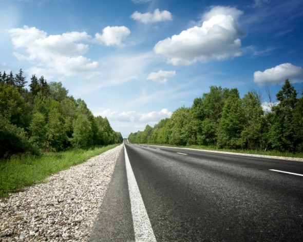
Typeface in streets :D
 Sans Seriff (To emphasize for drivers)
 Script(looks fancy)
 Slab Seriff(looks fun for youth)
 Script ( makes it look elegant)
Subscribe to:
Posts (Atom)